Why We Completely Redesigned our SaaS Product
JotForm made the mistake that many SaaS products are making today. Here's what the company did to right the ship.
March 15, 2017
By WeathersfieldTM
“Prehistoric product” was what someone called our product on a social news site. It stung a bit. How could that be true? We saw ourselves as cutting edge. We were always improving our product and released a new version of our product every few days. We were innovating on so many different levels that our competitors’ products were not even close.
We made the mistake that many SaaS products are making today. We didn’t look at our product from a fresh outside perspective. When we started seeking outside feedback, we started getting an accurate picture. Even though we had a solid product, people assumed the otherwise. We were being held back by our aging design.
No matter how you feel about your product, what really matters is how people feel about it. When we started asking people about our design with usability tests and surveys, we started facing the truth. We were really prehistoric. At least on the outside. This was a good problem to have though. It was something we could solve to unleash our growth.
How we fell behind
I founded JotForm, an online form builder, in 2006. For the last decade, I’ve watched firsthand how best practices for design have evolved and risen in importance. JotForm was the first WYSIWYG form builder, and at the time, that was innovative enough. Web design was in its early stages, and sites were text heavy and would be considered outdated and unpolished in today’s standards.
Web design advancement marched forward with elements including navigation, more thoughtful content, calls-to-action, 3D buttons, and splash pages. Structure and intuitive navigation rose in importance and web design ushered in a new era that focused on appearance and user experience. People wanted to easily find what they needed within a sleek-looking website.

In the early 2000s, there was an increase in usage of CSS, which gave greater creative freedom to content and design. Web pages became more organized, and links began to be attached to icons rather than just text. Websites were quicker to load, more stylish, and more user-friendly. Our tool has been continuously updated along the way, but we had not rolled out a completely new design update since 2010.
How we typically update our design
The way we update our tool is through continuous deployment and working in piecemeal: We would update a component of a tool, and after testing it to make sure it was in fact easier to use, we would roll it out. This is how our tool came to have a sleek and modern “Thank You page widget,” yet the surrounding tools hadn’t been updated to reflect this change. Users would slowly experience upgraded parts of the tool until they all came together.
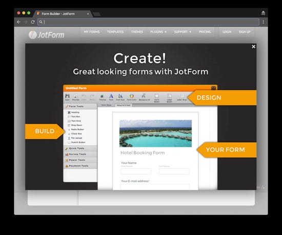
Although we had made design updates here and there, we’ve traditionally been a product-focused company and have been the most excited to work on functionality over UX and design. Product design has moved forward at a rapid pace, and we knew that our product could stand to be a lot prettier. We wanted to address the feedback that suggested that although our product was advanced, our design was stuck in the 90s.
Making the decision
We were continuously adding new integrations, more advanced functionality, and building upon the product that we had. However, there came a point where we knew that it wouldn’t be enough. We wanted JotForm to be completely mobile-friendly in every single way, so that our users could have the same great experience building forms on their phones and tablets as they do on their computers. None of our competitors offer this capability, and we knew that the time was now. We decided that we were going to move forward in building JotForm 4.0, which would be fully mobile-friendly.
Making JotForm completely mobile-friendly was enough of a reason why we knew we needed to completely redesign our tool. But another thing could also be reason enough- our tool’s appearance was holding us back. For years, we had focused on powerful functionality, building integrations and new features. Our emphasis on product performance was at the expense of our design, which had not moved forward at the rate that it should’ve. We heard feedback that our tool looked ugly, old-fashioned, and stuck in the 90s. Although this stung a bit, but we completely agreed and acknowledged that we our product’s appearance was turning off new users and hindering our growth opportunities.
Although we theoretically shouldn’t judge a book by its cover, the care that a company takes in making its products intuitive, beautiful, and thoughtfully designed often does speak volumes about how much effort they put into other aspects of their company, including the product itself. We knew we needed to do something drastic, so we set to work.
How we moved forward
Redesigning an entire product, especially one that has been around for about a decade with layers of added features, was going to be an enormous undertaking. We started by running usability tests to understand on a deep level what was not working with our product, what areas were hard to find and understand, and what we could be doing better. We conducted usability tests by giving assignments to users who have not previously had experience with our product. Because the vision for our product is that anyone can use it to create online forms, it needed to be accessible and welcoming for everyone, especially non-technical users.
We would give them simple tasks to complete, such as replicate a basic form with 3 form fields. They would talk through their thoughts and actions, and provide feedback every step of the way. From the sheer number of usability tests we ran and data we collected, we were able to notice trends. For example, our interface was intimidating. Similar to how Adobe Photoshop offers dozens of features all at once even though you may only want to use 5, our interface contained many buttons and options.
Many of our product testers were initially confused and overwhelmed by the candy-shop variety of assortment we had going on. We knew we needed to scale it back and simplify our design. We embraced flat design, simple icons, and making a beautiful product a priority. We mobilized the team with hack weeks to drive creative thinking and collaboration.
We brought back the fun to our product
Creating online forms and collecting their data does not typically get people on the edge of their seats. However, getting creative and making something of your own is rewarding. We conducted research and got some valuable feedback with surveys. Users thought that using JotForm was fun. This was a recurring theme that inspired us. Fun they say? Let’s turn the fun way up!
We set to work with branding and increasing customer delight. We injected colors into our drab interface and icons. Our designers created a cartoon cat mascot that guided our users through their JotForm experience- always ready with a helping hand and with a smile. We had a lot of fun in the process internally, from giving feedback on designs and voting on our mascot’s name (Podo).
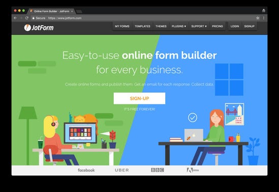
We determined our company personality, and updated messaging to give our customers a little more joy in their day. Instead of “working,” they were creating. Instead of having to read through manuals and heavy text, they were sent helpful information in digestible chunks. Our entire website took on a friendly tone, which is an important part of JotForm’s redesign.
Hack weeks pushed innovation forward
Our hack teams were divided into cross-functional teams. They worked together every step of the way throughout the different steps in the hack week journey. They started by brainstorming, collecting the data they needed, and defining the product roadmap. Then they built a product together. On Friday, the company got together to see the creative results of the week. Each team presented what they did and why, and demoed their product.
The whole company gives them friendly critiques and we all discuss what we like and don’t like. There is a winning team of each hack week and they get bragging rights. All teams get back to work for round 2 and round 3, and are encouraged to use ideas from other teams. The point, after all, is to make JotForm better. After 3 hack weeks, the team’s products tended to aligned and become more similar, because the best ideas and features were incorporated. Over 3 weeks of showcasing the best, most innovative, and most useful features – the team’s products became better and better over time.
Defining our mission for the redesign
In additional to our focus on ease of use we wanted to make sure that our form builder product had set of ideals to aim. We defined them and made them clear:
1. Be mobile first. Work on any device.
2. Let our users focus on their forms without getting distracted by clutter.
3. Provide a clean and modern page layout.
4. Provide a meaningful navigation and content architecture.
5. Allow building forms as a team. (Collaboration)
6. Build a form editor with smooth drag & drop.
Building a culture with design focus
Moving to cross-functional teams and having at least one designer in each team was probably the biggest reason for our success. Designers and engineers work side by side. There is a constant discussion and feedback loop that allows our teams to have design focus at everything they do.
In the past, our designers worked on their own corners and our engineers worked on another corner. Once a design was signed off, it was sent to engineers. Design was just an afterthought. Even if the design was worked out first, it was still out of sync with what engineered built. Having designers in the same room with the engineers solved all these problems. So change in our product went out without touches from a designer.
 Going Beta
We knew that the only for us to find our way and build a stunning product that worked well for everyone was to work with our users continuously. We engaged thousands of our users. We received over 2,000 pieces of feedback. We run hundreds of usability tests. Every feedback and every usability test brought us little bit closer to our goals.
The results
After 1.5 years of development we have just released the new version of our product, JotForm 4.0 with a great fanfare. The new version is beautiful, easy to use and intuitive. It is also 100 percent mobile-friendly. We also have a variety of new features to offer, such as enhanced collaboration, continuous save, and offline capabilities.
But, the biggest result of our efforts was to build a culture that values design first. JotForm 4.0 is not an end, it is a beginning for us.
About the Author
Aytekin Tank is the founder and CEO of JotForm, the first and only full-featured online form building tool that is completely mobile friendly. JotForm allows anyone to create forms and collect their data, without writing a single line of code.
You May Also Like
