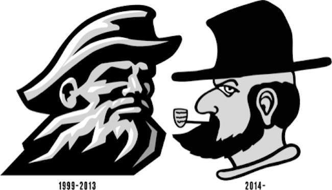
It is amazing how much criticism a bad logo can get. Case in point: Appalachian State University earlier this month unveiled an official new secondary logo for the school's athletic department—a uniquely distinguished figure that Fast Company describes as ‘a Simpsons rendering of Abraham Lincoln’s drunken evil twin.’
December 17, 2013

By Marie Alonso 1
It is amazing how much criticism a bad logo can get. Case in point: Appalachian State University earlier this month unveiled an official new secondary logo for the school’s athletic department—a uniquely distinguished figure that Fast Company describes as ‘a Simpsons rendering of Abraham Lincoln’s drunken evil twin.’
True, the new logo—an update of the strong and stoic yellow and black logo launched in 1999 to honor the university’s mascot, Victory Yosef—shows a scowling, angry, perhaps even annoyed man smoking a corncob pipe and with a top hat hiding his bald yellow head. Not exactly a visual victory for Victory Yosef.
Think logos are not that big a deal?
Reactions to the new Yosef should change your mind!
Fast Company Co.Design: “Is this the worst logo update of 2013?”
CBS Sports: “The news is just now finally making waves, because look at that fella. This is for real. This is the new logo, effective immediately. His name: ‘Victory Yosef.’ Appalachian State’s new logo appears to be modern-day Brooklyn hipster.”
Deadspin Contributor Barry Petchesky: “At gunpoint, I’d say the guy on the left was a sea captain, or maybe the Gorton’s Fisherman. With Appalachian State moving up to the FBS next season, they needed something a little more evocative of ‘mountaineer.’ So they’re switching to the guy on the right, presumably after an intense design competition featuring many magic markers and cocktail napkins.”
Logos can be intensely personal representations of a business, school or organization. So, with that, we should all embrace the new Victory Yosef which, according to Appalachian State, accomplishes the goals of refreshing the university’s secondary logo and rallying the campus, alumni and friends of the university behind a vibrant, freshly creative endeavor.
Still, if you have a logo reboot in mind, you may want to consider the following:
Your new logo should be a true representation of the spirit, theme, mission and services of your company. True, that is quite a bit of visual content to load into one very important graphic, but finding the right balance of color, texture and imagery can make your logo what all strive to be—memorable.
Your logo is your brand. Think of Starbucks. The hauntingly friendly mermaid with her brilliant crown and welcoming facial expression, not to mention billowing curls and snapping tail. What does a mermaid have to do with gourmet coffee and scones? Everything, when you think of the branding Starbucks has created with this now iconic visual. Your logo should be unique and recognized, just like the mermaid of Starbucks.
New logos or logo reboots have a great purpose—the translation of what your company is and what your company does to the masses. You know what that means, right? It needs to look great in print, online and on a smartphone. It needs to be a flexible, dynamic design that can boost its colors—and still carry your company’s branding flag brilliantly in black-and-white contours. Make your logo flexible, with a simple yet unique design that can play to all audiences.
Does your company have its own unique corporate culture? Consider reflecting that visually in the graphics of your new logo. Remember, a logo needs to be an accurate, appropriate representation of a business. Make sure to select colors that speak to the culture of your company, as well as the nature of your company’s expertise. One quick look at a logo can convey to a person a company’s spirit, strength and character.
When it comes to a new logo, whether the new “Victory Yosef” or the next great visual for a restaurant franchise or B2B company, the colors, tones, textures and creative visuals that comprise it need to be a true and lasting impression of the energy, expertise and “lifeblood” of a business. Take the time required to consult with a graphic artists, design company, marketing agency or creative consultant to confirm the right colors, designs and visual stylings that best represent your business. The result will be a visual that everyone will cheer for with gusto! (Sorry Yosef)
 Marie Alonso is an online marketing and media strategist at Miles Technologies, a leading IT company. The Miles Technologies team contributes business-driven content to The VAR Guy regularly.
You May Also Like
